Packaging Labels: Birutaro
Main Idea
This project was to design a type of beverage brand by ourselfves. Our goal for this project was to make a well designed system of three different flavors of the prand with their own visual imagery. Said imagery for my project is meant to get the viewers attention when compared to the compotition by utalizing shapes, lines, type, and contrast.
Narritive
The main idea of this project was to ulilize a popular Japanese folktale.The folktale in question is known as Momotarō. In this tale, a boy born from a peach befreinds a dog, fezent, and monkey to go after a jJapanese monster, known as an oni. The three animals he recruits are the same types of animals used in the can designs. The name itself is alos inspired by the boy's name, with the addition of the Japanese word for beer. A nother inspiration were three of the recent Pokemon that were introduced in the latest game's dlc, which also took insiration from the same source. The colors are the same as the Pokemon, but swaped in all three cases.
Insperations of Design
These were the inspirations behind the design.
Details of Front
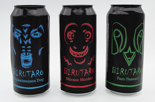
The front of thw three cans utilize one of three different colors to signify which flavor is which. The designs are also different, with the faces of a dog, monkey, and fezent for each one. The background of the faces is complete black to allow both it and the text to stick out further. (See Figure 1.1)
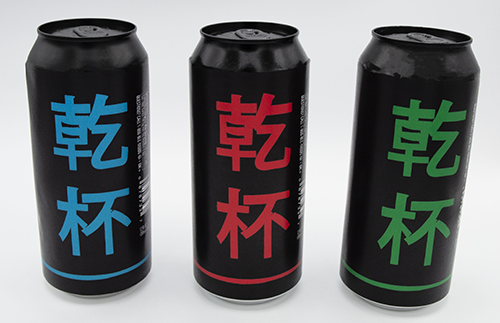
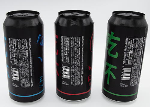
The back has similar aspects to the front, only replacing the imagery for text. The Japanese translates to kampai meaning "Cheers" in the language.
One thing to take note of is the detail of the faces having an abnormality with their right eye. This is to help them stick out comapered to other beers in the market and to grab people's attention.
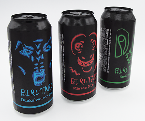
And this is just a series of four images of the final work:
Conclusion
In conclusion, this was one of my favorite projects that I worked on. This is due to the inspiration I took and the effort I placed in it as a result.